The mystery of the lesser-known GO transit logo that disappeared
The GO logo used to be very different from the one we see today. What happened to the old design?
Jan 4, 2021
“Anyone remember this short-lived logo?”
It’s a question Christer Tepper recently asked in a Facebook post to the group ‘Canadian Trains’, sparking conversation amongst transit fans and veteran GO Transit staff.
This online chatter about a GO logo that’s different from the one most of us have known for generations, prompted Metrolinx News to do some investigating of our own.
To start, the design was unique.
It showed several slightly slanted GO logos overlapping each other with the word ‘Transit’ next to them, along with a line trailing off the last letter.
Christer Tepper took to Facebook, hoping to find some answers to a burning question: What happened to the old logo design?
Tepper is a transit photographer, violinist and Lamborghini salesman – you read that correctly – who first noticed the new design nearly 20-years-ago, while commuting from Burlington to Toronto.
He was waiting on the platform when his train pulled in one morning with a very different logo.
“It appeared blurry when in motion and it was difficult to read on the locomotive,” recalls Tepper.
“I thought it was an interesting concept, but the original GO logo is timeless – simple, bold. Why fix what isn’t broken, right?”
Tepper didn’t ask many questions back then but recently he bought an HO scale (1:87) model train of GO Locomotive 527 which happens to have this lesser-known logo on it.
“I was curious if anyone else had any info – it was different and stuck out,” says Tepper.
According to Doug Smith, Metrolinx senior manager of fleet maintenance, in early 1999 a decision was made to refresh the logo on the side of the locomotive fleet, based on a logo design originally used on the GO Bus fleet.
The logo on the buses were slightly different and had an outline of the city at the end of the line trailing off the last letter of the word transit. (Dan Dell’Unto Photo)
This design didn’t fit on the carbody (the body style) of the locomotives.
“We removed the cityscape from the tail end of the “T” but that only addressed one side,” explains Smith, who’s been with the company for more than 31 years.
“To get a reversed version for the other side, the tail would have to stretch out towards the front of the locomotive, which looked terrible.”
Originally the design was supposed to be a bit bigger and applied on the exterior engine room doors. However, the decal didn’t really flow in the way it was anticipated.
To make it work, the size of the design was reduced and placed under the operator’s window.
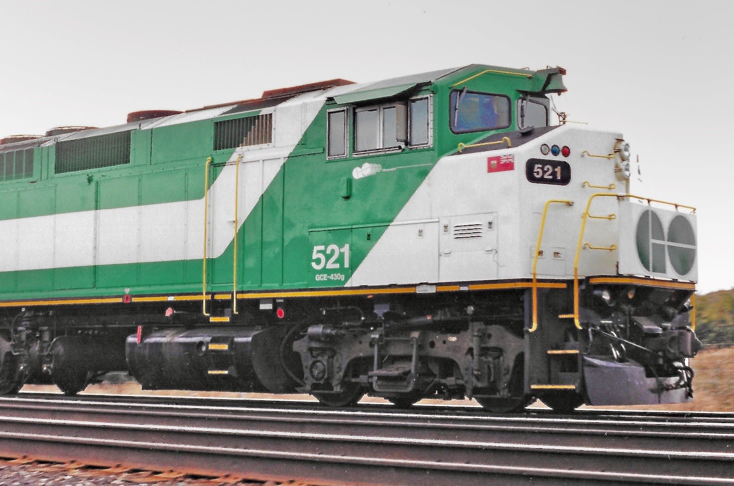
The logo was applied on as a trial on some of the F59 locomotives (520 and 521) and appeared blurry from a distance. (Christer Tepper Photo)
It was quickly determined that the design wasn’t going to achieve the desired effect and only lasted several weeks on the locomotives.
“I believe this iteration was to show motion, speed and visually express going places,” explains Michael Nÿkamp, an Independent Creative Leader and Director at MKN Design.
He didn’t work on the design, on his website, Nÿkamp has a section called Canadian Chronicles, a personal initiative highlighting brands designed in Canada.
Nÿkamp also highlights that throughout the years GO Transit has been around the wordmark has always been modified to various type treatments.
A quick look at the GO Transit wordmark over the years. (Graphic by Michael Nÿkamp of MKN Design)
One design that hasn’t changed is the bold “GO” logo. In a previous blog post we explained that the design represents two wheels forming the letters ‘G’ and ‘O’ while having the letter ‘T’ lying on its side. Those letters stand for ‘Government of Ontario Transit’.
Though we wonder whether you ever noticed that ‘T’, Nÿkamp also points out the letters ‘G’ and ‘O’ visually illustrate the undercarriage wheelset.
The bold and simple GO logo continues pass the test of time with little difference between the original 1967 version (left) and 2020 (right). (Graphic by Michael Nÿkamp of MKN Design)
Tepper says he wouldn’t change the one used today and he’s glad to see GO Transit didn’t stick with lesser-known logo design.
It simply wasn’t well received.
In the end, the logo was very much a no GO.
