Share
New (T)ransit wayfinding identifier hits the streets
A new universal transit symbol is coming to a transit project near you.
Feb 2, 2020
If you take the same route from the same stop every day, you might not think too much about the symbols used to identify transit.
But think about this, when you visit other major cities around the world, it’s the transit symbol that catches your eye across busy streets amid a sea of other signs and symbols, telling you ‘hey, over here, this is where you get on transit’.
That’s what the new wayfinding ‘T’ symbol is going to do for customers here.
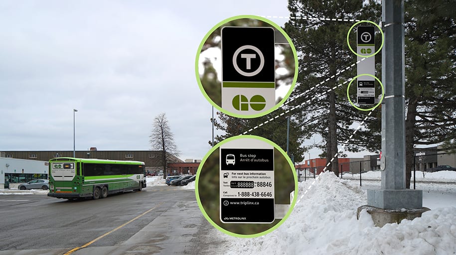
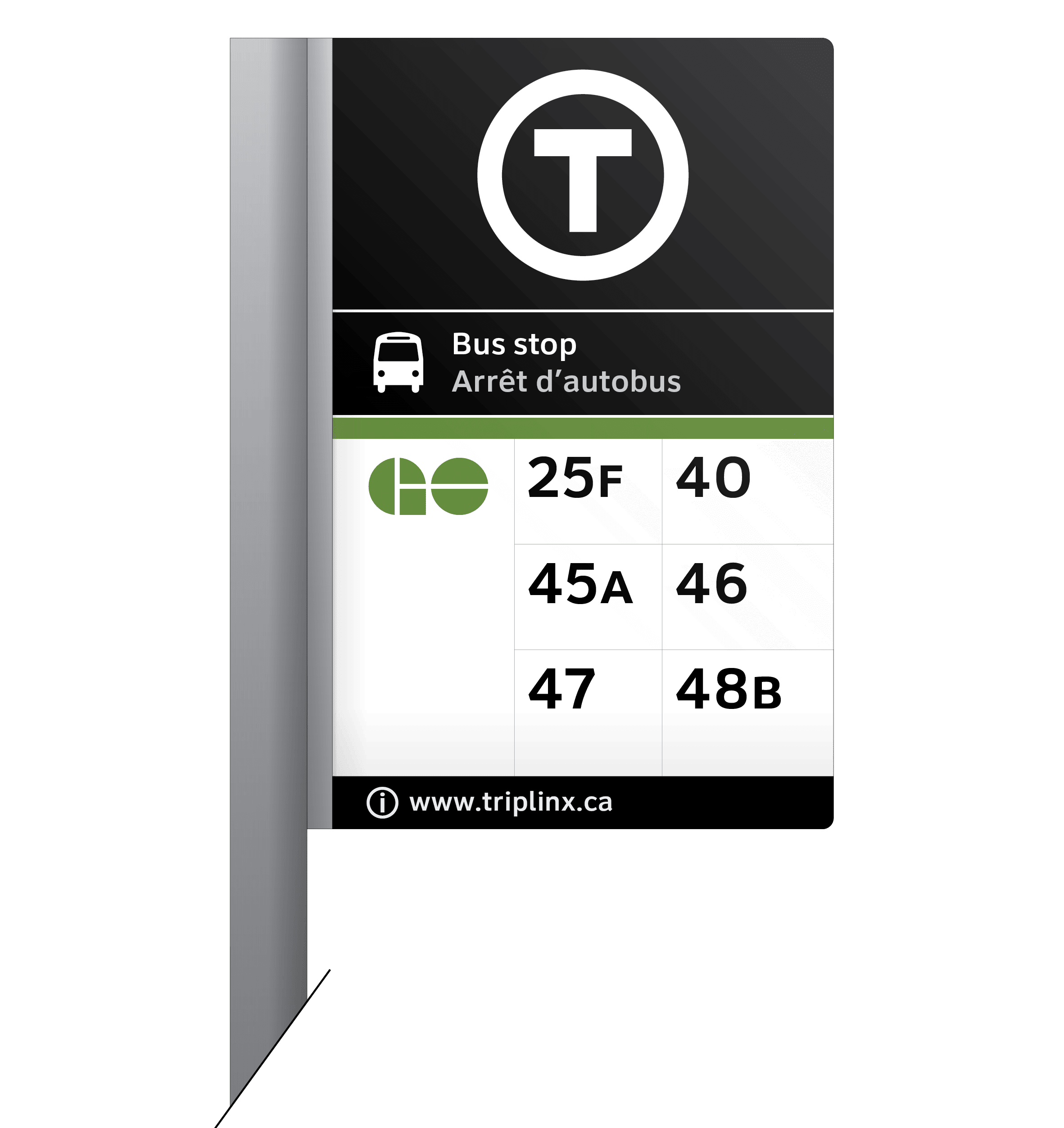
An example of the new universal transit symbol at a GO Bus stop. (Metrolinx photo)
The T stands for transit. It sounds simple, but it’s part of an intricate set of new wayfinding tools, helping new and regular transit customers find their way.
The ‘T’ is planned for use across the region, with the signs already being used at GO Bus stops and you can expect to see it on new transit projects like the Eglinton Crosstown LRTs too.
How did we land on the T?
It took a lot of research and feedback from various agencies and customers to get here.
One year ago Metrolinx introduced many of you to Toban Allison, when he was looking for customer feedback during Metrolinx’s Wayfinding Pilot. Today, Allison is seeing that feedback come to life as new wayfinding tools are rolled out and becoming the new fabric of a better, more seamless transit system.
“This goes beyond bus or train schedules,” says Allison. “It’s signs that are easier to read, it’s more intuitive icons and it’s also the new transit identifier tying the system together.”
Around the world, transit systems like ones here in the Greater Golden Horseshoe, are made up of different modes, operators and areas. They are often identified by easily recognizable symbols – they help people identify different types of transit that form part of a wider network.
The Transport for London ‘roundel’ is an iconic and historic identifier of transit in the UK capital.
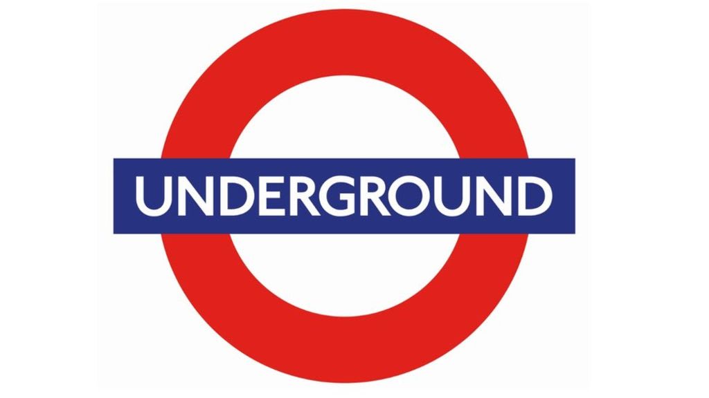
London’s classic transit symbol is recognized worldwide. (Stock image)
Closer to home, Vancouver’s TransLink started using a ‘T’ in 2009.
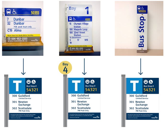
Translink in Vancouver uses a very similar T symbol on their bus stops. (Translink photo)
Here at home, the research behind the simple design began during the Wayfinding Harmonization Project with input from 10 transit agencies across the region, the Metrolinx Accessibility Advisory Committee, and these five guiding principles.
- Identify transit – be intuitive for unfamiliar and new transit users
- Be inclusive – be legible, memorable, simple, and useable at different sizes without loss of clarity.
- Be mode neutral – represent all public transportation
- Be brand neutral – symbolize the coordination and connection of transit services across the region.
- Be timeless – adaptable to new needs in the future
Believe it or not, over 150 unique symbols were explored, including letters, abstract symbols, illustrations and the use of existing operator logos. Eventually, we narrowed that list down to 14.
We enlisted the help of the Regional Reference Panel, a group of volunteers randomly selected to provide input to Metrolinx on issues shaping the region, to help choose a graphic to pilot. The group ultimately landed on the double chevron. However, during the pilot, the feedback was clear – the chevrons suggested movement but did not identify transit.
“Transit users are still leading this project – they’re telling us what works and what doesn’t,” says Allison of the feedback he received.
The new ‘T’ symbol is meant to be an intuitive icon that makes it easy for new and regular commuters a like to find their way. (Metrolinx photo)
Allison is quick to point out that ‘T’ does not replace any operator’s brand or logo – it’s an additional element at the top of the hierarchy that is intended to be consistent across the region.
“Operator logos are an extremely important part of how users understand the transit network,” Allison added. “Understanding who is providing you with the service, and who you hold accountable for that experience, needs to be clear to customers.”
Next steps for wayfinding
Allison says, the ‘T’ will be rolled out on GO bus stop signs, along the Eglinton Crosstown LRT as that project gets closer to completion and eventually across all Metrolinx-owned infrastructure.
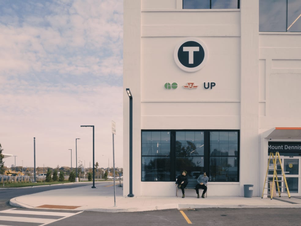
An example of the T symbol in use on the Eglinton Crosstown LRT project. (Dylan Farley Toombs image)
“Our transit partners across the Greater Golden Horseshoe will also be encouraged to use the standard and the T especially, as a way to start stitching together the network,” he says.
It’s easy to forget how much work goes into the dozens of signs and symbols we see every day in our travels. Metrolinx is hoping they’ve settled on a letter that will fit commuter’s needs, to a T.
Editor's Note: This story was updated on Jan. 8, 2024 to reflect updates to the wayfinding project.