Visualizing data helps us better understand how we move
Take a look at some visuals to better understand Metrolinx's services and customers.
Sep 7, 2018
The idea of number-crunching and analyzing data may seem boring to some. For others though, processing information and turning it into something more is a passion.
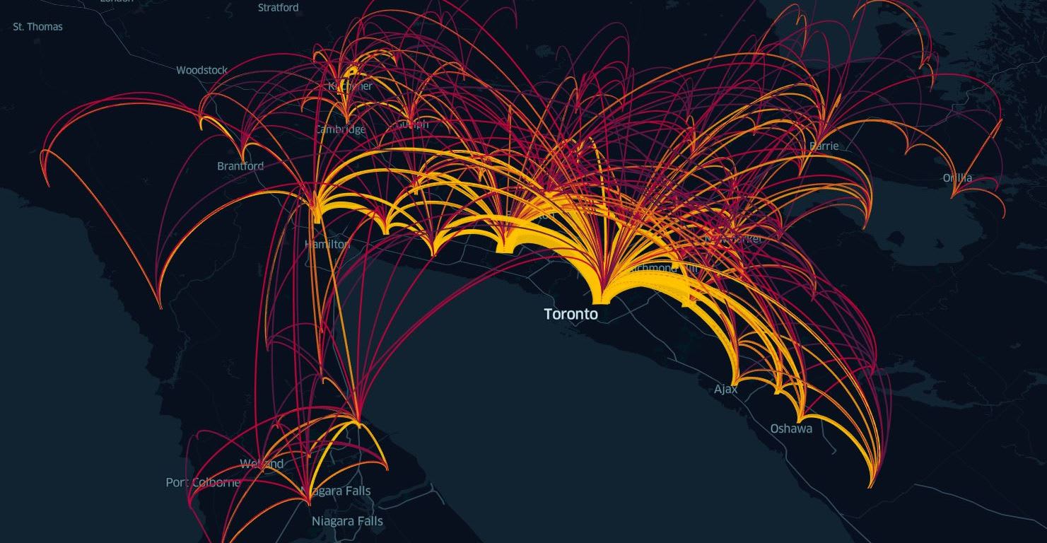
Anthony Smith loves visualizing transit and transportation data with maps and animations. By doing so, he hopes his work can make a difference by providing an evidence-based approach to city planning.
“I think data gives a voice to everyone,” said Smith. “As an urban planner, I believe that using the data to inform how cities grow ensures efficient use of available resources for maximum public benefit.”
Anthony has been conducting data science and producing maps and infographics for more than ten years. While he does work at Metrolinx, he also spends a great deal of time creating images in his own time.
“It’s always exciting to discover a new dataset or visualization tool that I can use to create something,” said Smith. “Just last week I discovered an open-source tool created by Uber that produces 3D visualizations of flows between cities or bike share trips between stations over the course of a day.”
The conversations that develop when people see one of his new designs is what Smith enjoys. “I like the conversations I have with people when they see one of my designs,” he said. “Each map or infographic is like a treasure hunt and the reward is seeing the final project online.”