Why Crosstown LRT wayfinding is different from other lines
Metrolinx experts guide you through Crosstown wayfinding by answering some most asked questions.
Jun 17, 2021
Come this way.
This story was created to guide future travellers along the new Eglinton Crosstown light rail transit (LRT) project, and how posts and signs and even fonts will make it easier to use transit in Toronto – even though they’re a bit different than others now used.

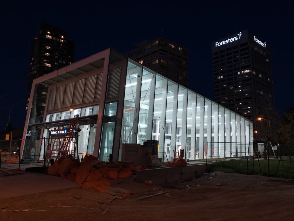
A look at Science Centre Station construction at night. (Metrolinx photo)
With the recent start of vehicle testing along the Eglinton Crosstown line, many people have been asking questions on social media about signage, fonts and wayfinding. And it’s a big and important topic, as the decisions aren’t as much about aesthetics as they are about helping all people – no matter what hurdles they face – get to where they need to be as easily as possible.
Because wayfinding is a science that is constantly evolving.
So Metrolinx has brought in the wayfinding and design standards team to respond to some of the top questions posed by the public, as well as provide some important background information. To help, they’ve created this chart which quickly breaks down how Crosstown signage and directional decisions have been made, and why some are different than other transit agencies, including the TTC.
No matter what information can be included in a graphic, wayfinding is big and constantly evolving. Better ways are being implemented and new insights found.
Speaking of ‘wayfinding’, you may also be interested in this story.
by Toban Allison Metrolinx senior advisor, Wayfinding